Tianyi Wang 王添一
tianyi
Critical Reflection of Unit 3
A Study of Color Language in Peter Doig's Paintings: Subjective Color Reconstruction in a Cross-Cultural Context
1. Doig's Artistic Background and Creative Motivation
In my view, the formation and development of Peter Doig's distinctive color language are closely tied to his personal experiences and artistic pursuits. Born in Edinburgh in 1959, Doig navigated a complex journey of cross-cultural migration—relocating to Trinidad in childhood, growing up in Canada, studying in London, eventually returning to Trinidad, and subsequently residing and creating in cities including New York and Düsseldorf. This life spanning three continents shaped his perspective as a "perpetual outsider" while cultivating a diverse visual lexicon of color. Doig once confessed: "My thoughts are always moving between different places, and I want to create a space between them in my paintings." I believe this space is not merely geographical but also a chromatic psychological liminal zone.
From a broader contemporary art perspective, Doig's artistic trajectory maintains a nuanced relationship with prevailing art movements.
During the 1980s and 1990s, the British art scene witnessed the rise of the Young British Artists (YBA) movement, epitomized by Damien Hirst, alongside the dominance of minimalism and conceptual art. Doig did not blindly follow these trends, instead persistently exploring new possibilities within the traditional medium of painting.
In a 2013 interview, he stated: "I thoroughly enjoyed being a painter during that era, and I believe my paintings reflect that. I certainly didn't like following trends. I think it's a major mistake for an artist to go with the flow and become part of a group." This independent stance allowed him to distance himself from the prevailing conceptual art of the time, focusing instead on deepening his exploration of color and painterly language.
Though often categorized as landscape painting, Doig rejects traditional definitions of the genre, instead blending dual perspectives: depicting memory while simultaneously tracing the origins of imagination. His creative process typically begins with fragments of photographic images, film stills, or personal recollections, which he then transforms through a subjective color filter into visual narratives imbued with an air of mystery. As he himself stated: "I never considered myself a painter who creates series," yet he "frequently reuses old images." This recurring exploration of specific motifs—such as canoes, snowy landscapes, and architecture—provides a continuous field for his color experiments.
Doyg's life experiences profoundly influence his color choices. During his Canadian period, snowy landscapes, lakes, and forests frequently appear, with color palettes leaning toward cool tones, powdery blues, pale whites, and dark branches. Examples include works like Cobourg 3 + 1 More and Blotter.
During his Trinidad period, defined by Caribbean islands and tropical climates, his palette shifted to grass greens, ink blues, ochre, black, and rich hues, exemplified in works like Pelican and Pelican Island.
His London phase then introduced intense urban environments and nightclub culture, yielding strong urban vibes and striking color contrasts.
Doig's color choices are far from arbitrary; they are deeply rooted in his emotional memories and visual experiences. He once described in an interview: "Snow possesses a magical power that always transports me to deeper places within myself. I am thrilled to discover these landscapes within my mind." This technique of connecting inner emotions with external landscapes through color allows his work to find a unique balance between figuration and abstraction. After relocating to Trinidad, his palette underwent a significant transformation, responding more acutely to the Caribbean's "wonderful contrasts of light and extreme shadows." This sensitive reaction to the specific light and colors of his environment reveals the inherent logic of his color language—not an imitation of the objective world, but a chromatic translation of subjective experience.
2. Aesthetic Characteristics of Doig's Color Language
· A Non-Traditional Subjective Color System
Doig's use of color completely breaks away from traditional painting's reliance on "intrinsic color" and "accidental color," establishing a highly personalized subjective color expression system. Similar to my own narrative expression, in his work, color ceases to be a means of depicting the objective world and instead becomes the primary vehicle for constructing psychological space and conveying emotional experience. For instance, in the work Blotter, Doig depicts his brother standing on a frozen pond. Yet he eschews actual natural colors, instead enveloping the entire scene in a subtle interplay of powder blue, pink, and mauve, creating a surreal, dreamlike effect. The orange of the figure's headscarf becomes the visual focal point, starkly contrasting with the surrounding cool winter hues. This color choice is entirely rooted in the artist's psychological perception rather than visual reality.
From my personal perspective, Doig's treatment of color exemplifies the liberation and independent significance of color in modernist painting.
On his canvas, color no longer remains bound by the constraints of form but achieves autonomous expressive power. As art critics have noted, Doig's colors are "fantastical and singular." Through his "non-traditional, subjective use of color, he transports viewers into a mysterious, fantastical otherworld, where the hazy, dreamlike hues deliver a unique visual experience." This autonomy of color allows Doig to transcend the limitations of representational subjects, striking a balance between expressiveness and symbolism.
· The Interplay of Color and Texture
The key to enhancing Doig's expressive power lies in his seamless integration of color application with rich textural creation. He adeptly employs diverse materials and techniques, including sinuous brushstrokes, thick, irregularly sized blocks of pigment, stripes squeezed directly from tubes, palette knife applications, and splattered dot textures. Visually, these textural languages add physical depth to the canvas while enriching the visual texture and expressive dimensions of the color layer.
In Ski Jacket, Doig employs a spraying technique to create hundreds of skier figures formed by pigment dots. These dots establish a visual rhythm across the canvas while altering the way colors blend and their optical effects. What should be a flat snowy landscape gains depth and variation through multi-layered color overlays and textural construction. Doig frequently allows paint to flow naturally across the canvas, forming "uneven watermarks." While these accidental effects add layers and richness to the composition, fostering organic development, personally, I do not endorse this lack of control over pigment in my own practice. My creative approach prioritizes more precise color expression.
· The Transformation of Memory and Reality Through Color
The color choices in Doig's work often stem not from direct observation but from memory-filtered recollections and imaginative reconstructions. He typically begins with photographs he has taken or images he has collected—a creative habit I share. Yet during the creative process, these images gradually lose their original authenticity, transforming into a visual logic reminiscent of memory, imbued with strong subjective coloring. Doyg describes this process: "I take many photographs and collect them. As I gaze at the images, the scenes depicted gradually lose their realism for me, replaced instead by my imaginings of those landscapes." This inspirational process enables his color language to serve as a bridge connecting objective reality with subjective imagination.
Doig's depictions of snowy landscapes particularly exemplify his reconstruction of memory through color. In 1994, he stated: "I often paint snowy scenes because snow is captivating." Works like Cobourg 3 + 1 More (1994) are not mere reproductions of Canadian scenery but poetic explorations of color that navigate between abstraction and figuration, seamlessly merging atmosphere and theme. Visually, I perceive the snow in these paintings not merely as a cold natural element, but as a vessel for warmth—carrying memory and emotion. It may evoke pale blue melancholy, pink romanticism, or deep purple mystery. Doig himself explained: "Snow has a magical power that always takes me to a deeper place within myself."
The symbolic meanings of color in Doig's work are often distinguished through distinct color palettes.
Cool tones (blue, purple, pink) typically convey tranquility, mystery, and dreaminess. On a symbolic level, they hint at the haziness of memory and the passage of time, frequently appearing in his paintings of snowy landscapes, night scenes, and lakes.
Warm tones (orange, red, ochre) convey warmth, passion, and unease, symbolizing vitality, emotional focus, and tropical energy.
Dark tones (black, ink blue) almost invariably imply melancholy, depth, and mystery, frequently appearing in paintings of forests, water surfaces, and night skies.
3. Doig's Color and the Contemporary Art Context
· Doig and Contemporary Artistic Color Trends
Throughout the evolution of modern and contemporary art, color's abstract and expressive qualities gradually liberated themselves from representational constraints. Chronologically, with innovations in pigments, color ceased being merely an attribute of objects—beginning with Impressionism—and became the protagonist expressing light and spatial relationships. Neo-Impressionism further propelled color into the realm of optical physics and the interplay of visual physiology and psychology. By the modernist era, color had entirely shed its imitation of macro-objects, shifting toward independent meaning within subjective and objective vision. Against this art-historical backdrop, Doig's chromatic language both embodies modernist explorations while infusing greater diversity characteristic of contemporary visual culture.
Unlike many contemporary artists, Doig never fully embraced abstraction, instead maintaining a balance between abstraction and figuration. His colors possess intense expressiveness while remaining connected to concrete imagery and motifs. For instance, in White Canoe, the canoe's form remains clearly discernible, yet the colors on the water surface exhibit rich abstract expressive qualities—interwoven brushstrokes of various hues create a dreamlike visual effect.
This delicate equilibrium allows Doig's work to retain narrative potential while possessing the chromatic tension of abstract painting, carving out a unique position and narrative approach within contemporary painting.
· Doig's Color Influence and Legacy
Doig's influence in contemporary art continues to grow, earning him recognition as "a painter's painter."
His color language has inspired a generation of young artists, including Kenyan artist Michael Armitage—whom I also admire and have discussed—and Argentine painter Varda Caivano.
These artists draw not only from Doig's bold use of color but also his methodology of transforming personal memory and cultural identity into visual narratives through color.
As a professor at the Düsseldorf Art Academy, Doig's teaching further amplified his color influence.
He reflected in 2013: "The dialogue with students in the studio is unique and immensely enriching, especially since teaching in Düsseldorf. My own painting has changed significantly, and observing others create and discussing their work has been profoundly rewarding. "I believe this dynamic of teaching and learning has enabled Doig's color philosophy to spread and evolve across a broader spectrum.
4. Doig's Colorary Insights and Influence
Peter Doig's color language offers profound insights for contemporary painting.
First, he demonstrates that subjective color is not merely an expressive form but a vital medium through which artists engage with memory, identity, and cultural recognition. In Doig's work, color transcends its role as a visual accessory to become the very essence of painting—a transformative shift with profound implications for contemporary artistic practice. Through color, he successfully constructs a unique space bridging memory and reality, the personal and the public, the figurative and the abstract, opening new possibilities for the evolution of contemporary painting.
Second, Doig's color practice reveals the potential for technical synthesis. He breaks the boundaries of traditional painting techniques, freely employing methods like spraying, dripping, and scraping to create richly varied color textures. This technical openness maximizes color's expressive power and offers a methodology for contemporary artists to draw upon. Doig's work teaches us that color's expressiveness stems not only from hue selection but also from the physical presentation of the color material itself.
Finally, Doig's artistic journey demonstrates how cross-cultural experiences enrich an artist's chromatic vocabulary. His transition from the cool tones of Canadian snowscapes to the intense hues of Trinidad's tropical landscapes reflects not only geographical shifts but also color's potential as a vessel for cultural identity. In a globalized context, this color language—capable of synthesizing multicultural elements—offers contemporary artists a visual strategy for navigating cultural identity.
Doig's color studies remind us that in the contemporary art context, the function of color in painting has shifted from representing reality to constructing psychological spaces and emotional experiences. His work breathes new life into easel painting while offering invaluable visual case studies for color research.

Ski Jacket, Peter Doig, 1994

Blotter, Peter Doig, 1993

Cobourg 3+1 More, Peter Doig, 1995

White Canoe, Peter Doig, 1990
The Visual World of Wolfgang Tillmans
While Peter Doig focuses primarily on easel painting, Wolfgang Tillmans uses his camera to examine the very substance of things, revealing the structures beneath the surface. Both of their practices show that colour still holds great potential, yet they represent two very different ways of artistic thinking. Through the medium of photography, this German artist has built a unique visual philosophy, fundamentally redefining the function and nature of colour, liberating it from its secondary, decorative role and establishing it as an independent subject in its own right.
1. A Democratic Approach to Colour
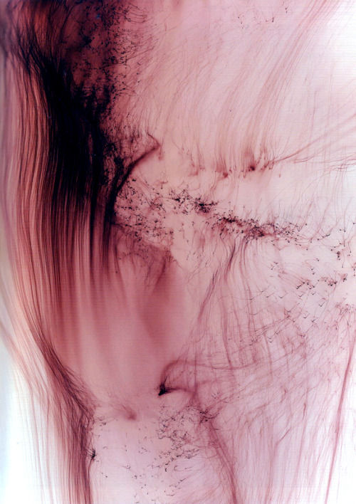
I believe the revolutionary aspect of Tillmans' work lies in how he completely frees colour from its traditional, servile function. In his Freischwimmer (Freestyle Swimmer) series, colour is no longer a tool for depicting objects; instead, it becomes the absolute subject of the image. Created by directly controlling light on photographic paper, these works show colour in its most essential state—as a trace of a chemical reaction, as the result of a physical process. The art critic Daniel Birnbaum commented on this: "Tillmans restores colour's autonomy. In his work, colour no longer needs to serve any narrative; its very existence is the purpose."
This exploration of colour's independence extends to how the artist installs his exhibitions. Tillmans deliberately breaks conventional exhibition norms, placing works of different sizes, subjects, and techniques side-by-side: a large, abstract colour field might hang next to a small portrait; documentary photography of a social movement might dialogue with a still life study. This installation strategy not only challenges the art world's hierarchies but also creates a completely new way of experiencing visuals. Curator Susanne Pfeiffer pointed out: "Tillmans' wall is a democratic space where all visual elements have an equal voice."
2. The Physicality and Process of Colour
I am convinced that Tillmans' handling of colour always shows a sharp awareness of its physical nature. In his Blushes series, colour takes on a fragile yet intensely physical presence. These seemingly random, yet carefully controlled, stains and blotches reveal the interplay of chance and control in the photographic chemical process. He once explained his method: "I'm interested in making the process visible, not hiding it. The so-called 'flaws' are precisely what prove the image is alive."
This exploration of physicality is also evident in how he thinks about the photograph as an object. Tillmans often uses simple binder clips to pin works directly to the wall, or places photos casually on tables. These display methods reinforce the photograph's attribute as a physical thing—they are not just carriers of images, but physical objects with volume, weight, and texture. This approach breaks the traditional myth of photography as a "transparent window," making the viewer aware of both the image's content and the physical object that carries it.
3. The Contemporary Politics of Vision
Tillmans' colour practice carries deep contemporary political meaning. We live in an era flooded with digital images and fast-consumed visual information. His work offers a possibility to rebuild trust in what we see. By insisting on showing the physical traces of the creative process, he constructs a visual strategy that resists the traits of digital images—their endless reproducibility and easy manipulation. Cultural theorist Boris Groys argues: "Tillmans' work is a direct response to the post-truth era. He makes us re-learn to trust our own eyes, not the images algorithms feed us."
This political dimension of vision is also reflected in his choice of subjects. From club culture to political protests, from intimate portraits to ordinary everyday objects, Tillmans' lens gives all subjects equal attention and dignity. This egalitarian gaze is not just an aesthetic choice, but an ethical stance. Through this practice, he shows us: what matters is not what you shoot, but how you look; not the perceived importance of the subject, but the sincerity of the gaze. I deeply appreciate this ethical fairness. In my own creative work and accumulation of matter, I also hope to convey that whether it's the detailed memories of daily life or abstract conceptual lines, they are all equal visual marks for me.
4. Reshaping How We See
Tillmans' overall artistic project ultimately points to one core idea: reshaping our way of seeing. By liberating colour from its descriptive function, by breaking exhibition hierarchies, and by insisting on the physicality of the image, he is effectively conducting a continuous visual enlightenment. His work urges us to set aside the visual prejudices from our education, society, and traditions, and to re-experience the world and perceive beauty using our most fundamental visual senses.
This inspiration is especially significant today. In a time when corporations and social media constantly use algorithms to shape our visual preferences, and where the attention economy steers us toward extreme content, Tillmans offers a path of resistance: a return to careful observation of physical reality, a return to the pure perception of colour and form, a return to trust in the visual phenomenon itself. His work reminds us that in this age of image overload, true visual freedom lies not in seeing more, but in learning how to see more truly and autonomously.
I believe that, because of this, Tillmans' use of colour transcends the realm of aesthetics. It becomes a tool for understanding the world (an epistemological tool), an ethical stance, and a political statement. His practice proves that in a world saturated with virtual images, the very act of insisting on physical reality is, in itself, a revolutionary act.
I hope that we can continue to uphold and practice the pursuit and exploration of the pure material image, in both painting and photography.
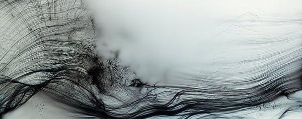
OSTGUT FREISCHWIMMER, LEFT, 2004